
Discover the Artistry of Edward Curtis
notes on collecting curtis
Discover the work of Edward Curtis across the many mediums he worked in. Learn how to tell authentic pieces from reproductions and understand the craft behind them.

Understanding Curtis Mediums
Edward Curtis is well known as a maker of powerful, evocative images of Native Americans. What is less well known is that he was also a gifted printmaker, possessing great technical ingenuity and virtuosity. Although his photogravures have frequently been reproduced for publication, few people have seen his original “master prints”—the fine art prints he made for exhibition or sale. His master prints comprise only one to two percent of his extant body of work.
The vast majority of vintage Curtis photographs are printed in photogravure, a photoengraving technique notable for its subtlety, beauty, and consistency. While photogravure offered Curtis a beautiful, but expensive, way to produce the quality and quantity of prints required for The North American Indian, he also made prints for a variety of other purposes—to get initial feedback on his negatives while still in the field, for reference and editing purposes, as experiments, and as finished prints that could be sold or exhibited. Prints done in several of these mediums are especially rare, and today often prized by serious collectors.
This guide introduces the different print processes that Curtis employed and describes their specific characteristics and relative merits. The term vintage as used here refers to prints made by Curtis or his studio prior to 1930, as well as to the first printing of the photogravures, which occurred between 1907 and 1930.
– Christopher Cardozo

Photogravures
Because they comprise approximately 98 percent of his extant vintage work, Curtis is known almost exclusively through his photogravure prints, commonly referred to as “gravures.” These hand-pulled photoengravings were printed by master engravers and printers in Boston primarily for inclusion in The North American Indian. Photogravure is essentially a marriage of photography and engraving wherein the photographic image is chemically etched into the surface of a copper-clad engraving plate. To make a photogravure, an interpositive, generated from the negative, is exposed and contact-printed onto a photosensitized engraving plate. After the exposed plate is developed out, it is placed in an acid-etching bath. The acid etches microscopic depressions in the metal surface, with the shadow areas of the finished image etched most deeply into the plate. After it is etched, the plate is cleaned, then inked and printed by hand, one print at a time.
Curtis used the photogravure process almost exclusively to produce the images for his magnum opus The North American Indian but in a few isolated instances employed the process for other images. The 2,234 images that Curtis selected for The North American Indian project were printed in an edition of approximately 300 impressions. In spite of its expense and difficulty, Curtis chose photogravure because it was one of the finest photographic printing processes available and well suited for inclusion in books and portfolios. The technique and artisanship of photogravure had reached their zenith by the early 1900s, and large numbers of prints could be made with very consistent results. The warm sepia tones and subtle, soft resolution of the photogravure process complemented Curtis’ imagery perfectly.
Originally, the photogravures made for The North American Indian were only available as part of complete sets. During the past thirty years, Curtis’ vintage photogravures have often come onto the market individually from broken sets or as prints that were never integrated into sets. Of the 2,000-plus images from The North American Indian, perhaps 400 to 600 were also printed as master prints in platinum, silver, and other photographic mediums.
Platinum Prints
Regarded as the highest form of photographic printing by many serious collectors, the process is both expensive and difficult, thus platinum prints are inherently rare. While relatively few photographers worked in platinum, Curtis did so frequently, leaving us with a wonderful body of platinum prints. Curtis may also be unique among fine-art photographers in that he created more platinum than silver prints for exhibition and sale. However, of the several hundred images printed in platinum, it is unusual for more than two or three prints of any one image to exist.
Platinum prints are known for their rich blacks, subtle highlights, and broad, nuanced midtones. Because the platinum solution actually permeates the paper, rather than being suspended above it, as in most photographic mediums, the platinum image appears to be integrated within the paper itself. Curtis’ best platinum prints are delicate, generally warm-toned, and typically printed on expensive textured watercolor paper. The texture of the paper further softens the image, making it more consistent with Curtis’ Pictorialist aesthetic.
Once the paper is sensitized with the rare noble metal platinum, it is exposed in sunlight (or another strong source of ultraviolet light); the image appears during exposure. The print is then immersed in a potassium oxalate solution, to dissolve the iron salts. The platinum remains, forming the photographic image.
Platinum prints are exceptionally stable, and while platinum itself does not oxidize, Curtis’s platinum prints at times may evidence some oxidation from residues of iron or other materials used in toning the print. With the possible exception of the G.T.P.O.P.’s, platinum prints represent Curtis’ highest form of expression. Although they are not as rare as the G.T.P.O.P.’s, platinum prints nevertheless comprise under half of one percent of extant Curtis prints.


Goldtones - Orotones
Also known as an “orotone” and a “Curt-tone,” the goldtone was a hallmark of the Curtis studio. Even though Curtis pioneered and popularized this rarely used medium just after 1900, he printed fewer than one of every 500 of his negatives in this expensive and difficult process. It appears to have been his favorite medium, however, and he wrote about it quite eloquently in his studio’s Goldtone Promotional Brochure:
The ordinary photographic print, however good, lacks depth and transparency, or more strictly speaking, translucency. We all know how beautiful are the stones and pebbles in the limpid brook of the forest where the water absorbs the blue of the sky and the green of the foliage, yet when we take the same iridescent pebbles from the water and dry them they are dull and lifeless, so it is with the orthodox photographic print, but in the [goldtone] all the transparency is retained and they are as full of life and sparkle as an opal.
The goldtone process is relatively simple to describe—the photograph is printed directly on sensitized glass instead of paper, processed, and then backed with a gold liquid wash or spray—but in practice it is very difficult to produce high-quality goldtone images. The fact that the emulsion is suspended on and supported by glass rather than paper creates a variety of limitations and difficulties. Nevertheless, Curtis was often able to achieve beautiful results, and his goldtones have become very valuable and highly sought after. The reflectivity of the gold backing, which is visible through the glass and the lighter areas of the emulsion, creates luminosity and a feeling of three-dimensionality that makes photographs printed with this process both unique and very appealing.
With few exceptions, Curtis printed goldtones in four sizes, ranging from 8 x 10 to 18 x 22 inches, although those larger than 11 x 14 are extremely rare. Despite the small number of negatives he printed in this process, several of those images were quite popular, and a number of goldtones exist of several of his most popular images. Most vintage goldtones have survived the years remarkably well considering their fragility, although the gold backing is more prone to chemical deterioration than most traditional photographic processes and is exceedingly difficult to conserve or restore.
goldtone paper prints
Gold-toned Printing-Out-Paper Print (“G.T.P.O.P.”). G.T.P.O.P. is one of the earliest forms of master prints Curtis made, and today they are exceedingly rare, with few examples surviving. The images Curtis printed in this process during a two- to three-year period beginning in 1898/99 are often dramatic and compelling, and provide a unique record of his artistry and technical genius.
The lightweight, delicate paper used for these prints was coated with light-sensitive colloidal silver. The paper was contact-printed with a negative, usually in bright sunlight, then processed and gold-toned. Because of the expense and difficulty, gold-toning had become largely obsolete by the 1890s, as much simpler and less costly processes became readily available. Curtis, however, created a very small body of exquisite G.T.P.O.P.’s for exhibition and sale, and a handful of these still exist. In general, they have a semi-gloss surface and a distinctive rich, reddish brown tonality due to the emulsion and toner combinations he utilized.

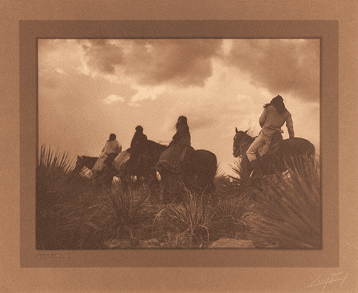
GELATIN SILVER BORDER PRINTS
Curtis produced a small body of toned gelatin silver prints for exhibition and sale, on papers that varied in texture, weight, and finish. Gelatin silver prints, the most common form of black-and-white photograph made in the pre-digital era, use silver salt suspended in a gelatin emulsion to form the photographic image. As with platinum prints, Curtis toned most of his silver prints intended for exhibition or sale to give them the warm sepia tone consistent with his subject matter and his personal aesthetic.
Exceptional toned gelatin silver prints have a rich quality but are rarely, if ever, as delicate, subtle, or rich as the finest platinum prints. Curtis’ toned silver prints, while relatively rare, typically have a warmer tone than his platinum prints. While his toned silver prints are generally not as highly regarded as his platinum prints, they nevertheless form an important body of work.
CYANOTYPES
Curtis commonly made prints while in the field to see what he had achieved, or failed to achieve, with his new negatives. Without access to a darkroom and the chemistry necessary for traditional photographic printing, Curtis chose a simple process for his field prints called cyanotype. The cyanotype process was invented in 1842 by photographic pioneer Sir John Herschel; it is a precursor to the technique architects use for blueprints. Like G.T.P.O.P, cyanotype is a printing-out process, meaning the image forms during exposure to light (and does not require subsequent chemical development). Curtis, or more likely an assistant, would place the negative in direct contact with a piece of paper that had been coated with a solution of sensitized salts. The exposure, normally made in a glass-fronted frame that held the negative in tight contact with the sensitized paper, was made in sunlight; the paper was then washed with water to fix the image. The chemical changes to the emulsion during exposure produced a rich blue tone (hence “cyanotype”) that became deeper and darker the more it was exposed to light. Curtis’ cyanotypes are now very rare since most have been discarded over the years. However, they form a powerful link to Curtis and his project and are often the only remaining evidence of a negative. While aesthetically something of an acquired taste, cyanotypes have a subtle yet often powerful beauty that is becoming more and more appreciated.


HAND-COLORED PLATINUM PRINTS
Curtis's hand-colored platinum prints were made in two stages: a platinum print was produced then color was applied to its surface by hand. They are among the rarest things he made. Platinum prints as a whole account for well under one percent of his surviving work, and only an extremely small number of those were hand-colored.
Making the platinum print. Paper was brushed with a solution of light-sensitive iron salts mixed with platinum salts and dried. The glass-plate negative was placed directly against the paper and exposed to sunlight or another UV source, so the print was the same size as the negative (larger prints needed an enlarged negative). Development converted the image to pure platinum metal, and acid baths cleared out the remaining iron. Because the image sits within the paper fibers rather than in a coating on top, the result is matte and relatively soft, with a long, subtle tonal range.
Applying the color. That matte, uncoated paper surface takes pigment much as drawing paper does, which made platinum well suited to hand work. The coloring was done with a combination of watercolors, oils, and pastels. The usual approach of the period was to lay color on in thin, transparent layers so the photographic image supplied all the drawing and shading, and the pigment only tinted it. The effect is typically restrained: warm skin tones, muted sky and earth, a few accents on clothing or water.
Finishing. Platinum prints were generally signed in ink at the lower right, and some were mounted on layered sheets of handmade, deckle-edged paper.
Two caveats: Curtis left little written documentation of his coloring procedure, so the step-by-step detail is inferred from the prints and from standard practice of the time. Also, because he was in the field for months at a stretch, much of the printing and finishing was carried out by his studio staff, so "hand-colored by Curtis" often means his studio under his direction.
BLUE-TONE GELATIN SILVER PRINTS
Curtis's blue-toned gelatin silver prints are a small, late body of work, quite different in subject and mood from The North American Indian. They date from roughly 1916 to 1930 and are known as the "Aphrodite Series" and the "Hollywood Stills."
Context. After his divorce, Curtis left Seattle around 1919–1920 and set up a studio in Los Angeles with his daughter Beth, supporting himself partly with film work, including stills for Cecil B. DeMille. The blue-toned prints come out of that period.
Subjects. The Aphrodite pictures are romantic, allegorical female nudes, often posed in or beside water, with titles such as "The Spirit of the Sea" and "Floating Aphrodite". A few other photographs also got the blue treatment. One example is an 1895 Mount Rainier waterfall view, printed later by Beth Curtis and signed by her father.
Process. These begin as ordinary gelatin silver prints: paper coated with a gelatin emulsion of light-sensitive silver salts, exposed under a negative and developed to a neutral black-and-white image. The blue comes afterward, from a chemical toning bath. I haven't found documentation of the studio's exact formula. The standard method at the time for a strong blue was iron toning, which converts the silver image partly into Prussian blue. Shadows go deep blue, the paper highlights stay white or cream, and the gelatin surface keeps a slight sheen.
Not cyanotypes. These are easily confused with his cyanotypes and shouldn't be. A cyanotype is an iron-based image formed in plain, uncoated paper, with no silver and no gelatin. It is matte and a flatter, more uniform blue, and Curtis used cyanotypes mainly as quick field proofs. The blue-toned silver prints were finished pieces made for sale, often in decorative period frames with an Aphrodite label on the back.
Rarity. Across all his toned silver prints, only one or two hundred negatives are thought to be represented, usually by just one or two prints each. The blue ones are a subset of that.

Print and Mount Sizes: Curtis’ vintage prints range in size from 4 x 5 to 24 x 32 inches or larger. The vast majority of his photogravure prints are approximately 5 x 7 or 12 x 16 inches; 6 x 8 or 12 x 16 inches (platinum and silver prints); or 8 x 10 and 11 x 14 inches (goldtones). All mediums include horizontal and vertical images. The smaller photogravures are printed on 9½ x 12½-inch handmade paper and the larger photogravures on 18½ x 22½-inch sheets of handmade etching stock or, in the case of the premium “tissue” prints, the “tissue” paper is slightly larger than the image and then overmatted with the 18½ x 22½-inch sheets and slightly smaller for the undermats. The “tissue” photogravures are mounted on a “Vellum” type paper and overmatted with Van Gelder paper. The smaller photogravures were originally bound in books and the larger ones were loose in portfolios. Goldtones, being printed on glass, are never mounted and virtually always framed. The majority of extant silver and platinum prints are unmounted, but some are mounted on single, double, or triple layers of handmade deckled-edged single-weight paper. Occasionally, Curtis’ silver and platinum prints are mounted on a stiff, heavy-weight board.
Negative Sizes: Originally, Curtis worked with large glass-plate negatives up to 14 x 17 inches and possibly larger; later negatives (post-1900) were typically 6½ x 8½ inches. Curtis is believed to have created 40,000−50,000 negatives of North American Indians and at least 10,000–20,000 studio portraits, landscapes, Gold Rush, and Harriman Alaska Expedition photographs.
Editions: Curtis did not edition his individual prints as such. However, his sets of rare books, The North American Indian, were editioned. And, by extension, the photogravures contained therein are of a limited edition. The first few volumes and portfolios were apparently printed in editions of somewhat over 300 (of a proposed edition of 500). Later, the edition size appears to have decreased to fewer than 300. Today, at least 220 of the original sets of The North American Indian are still intact as complete sets (and approximately 90 percent of those are in institutional collections). The following is a rough guide to the number of Curtis prints, by media, believed to exist.
Goldtones (also “Curt-tones” or “orotones”). Curtis printed approximately 60 to 70 of his negatives as goldtones. Prints of his individual goldtone images range from unique to possibly over 500 impressions for The Vanishing Race. A small number of images (fewer than 10) have more than 25 impressions in goldtone extant. A handful may have 50 or more prints still existing. For the majority of the remaining images, however, there are a relatively small number of prints extant. A majority exist in small numbers (10 or fewer). The most popular size for his goldtones was 11 x 14 inches, followed by 8 x 10, 14 x 17 (rare), and 18 x 22 (extremely rare).
While goldtones are a gelatin silver emulsion on glass, for purposes of this discussion they are treated as a separate category from other silver prints.
Platinum Prints. It is estimated that approximately 400−600 negatives were printed as platinum prints, but possibly as few as 200 as finished prints for exhibition or sale, typically in either the 6 x 8 or 12 x 16 size. There are generally fewer than four or five platinum prints from any given negative. Several of the most popular images are estimated to have 40 to 80 examples in existence in platinum in various sizes. There may be 200−300 or more platinum prints of The Vanishing Race, ranging in size from 6 x 8 to 17 x 22 inches.
Silver Prints. Untoned silver “reference” prints survive of well over 1,000 negatives, although most of these are in an archive originally filed with the Copyright Office, now part of the Smithsonian Collection. Generally, there are at most two or three “reference prints” that survive of any given negative, including one or two copies originally submitted to the Copyright Office. For toned silver prints, it is estimated that prints from only 100–200 negatives exist, and generally only one or two toned silver prints exist from any of those 100–200 negatives. A few of the most popular images may be extant in higher numbers. A small number (possibly fewer than 50) of toned silver prints were created as “border prints”. These are quite scarce, with generally only one or two prints per negative.
Cyanotypes. Of the 40,000−50,000 cyanotype prints presumed to have been created (at least one for virtually every negative), fewer than 800 appear to have survived. Each cyanotype is unique, and typically no more than one survives for any given negative
Experimental Prints. Hand-colored and other experimental prints are extremely rare, and each is a unique expression of the negative from which it was created.
Portfolios: Curtis did not create individual, thematic portfolios in the manner of many contemporary photographers. He did create 20 portfolios as part of his magnum opus The North American Indian. Each set of these rare books (done in an edition of approximately 272, of a projected edition of 500) comprises 723 large-format original photogravures contained in the 20 portfolios. These portfolios were created from 1907 to 1930 and were available only in a complete set, on a subscription basis.
Curtis also created more than 100 photographs for the two-volume Harriman Alaska Expedition albums. These albums of over 240 gelatin silver prints were done in an edition of approximately twenty-five.
Curtis undoubtedly created a few other albums of original photographs at some point, and at least one example of his work with the mountaineering group the Mazamas Club is known to exist.
A COLLECTORS GUIDE
HOW CAN I IDENTIFY AN AUTHENTIC CURTIS PHOTOGRAVURE?
There are many reprints, reproductions and some fakes of Curtis’ work. It is critical that a collector be well informed before purchasing Curtis’ work purported to be vintage and/or created during Curtis’ lifetime. Many of Curtis’ photogravure plates have been restruck (reprinted) since the 1960s. Various individuals and businesses have controlled the original copper photogravure printing plates, which still exist, and many have been restruck numerous times over the past four decades. Vintage photogravures are easily distinguishable by the paper support material they are printed upon. Each of the three original etching stocks has a distinct weight, texture, surface, fiber structure, etc. To a trained eye, all restrikes are easily distinguishable as such. The one exception is a very small body of major images that were (apparently) surreptitiously restruck on a tissue-like paper in the 1980s. It takes a highly trained eye and a magnifying device to clearly identify these fakes. Curtis goldtones have been both legitimately recreated and faked. The Curtis Centennial Project, Inc. has been creating contemporary goldtones from its archive of vintage Curtis negatives since in 1998. These are clearly delineated in a variety of ways including information in the glass plate itself. Jean-Anthony DuLac created a small body of goldtones in the 1970s, which are not clearly identified as such or easily delineated from the vintage ones. The small body of intentional goldtone fakes that were created principally in the 1980s likewise require a trained eye to distinguish from an authentic vintage Curtis goldtone.
While the author knows of no known examples of paper-based, non-gravure intentional fakes, creation of these will probably not be far off, as prices for Curtis platinum prints, in particular, have soared. Also, being largely in the public domain, innumerable Curtis images have been reproduced in everything from inexpensive knock-offs (inkjet prints, etc.) to fairly expensive platinum prints.
Lastly, Curtis Centennial Project, Inc. has been creating contemporary, limited edition prints in a variety of media (cyanotype, silver, platinum, photolithograph etc.) since 1998. These posthumous, original prints (made from Curtis’ vintage negatives, not copied from other prints) are clearly denoted by the contemporary copyright information embedded in each print (as well as other indicia). While these have been widely exhibited internationally few have come on the market for sale.
Thus, to make an informed purchase within the Curtis oeuvre, one must be able to distinguish between vintage prints, later prints created during Curtis’ lifetime, posthumous original prints (printed from Curtis vintage negatives), reproductions in a wide variety of media, and intentional fakes.
What are common signs of a Curtis fake?
Check for a dot pattern under magnification. This is the fastest test. Put a 10x loupe on the image. A true photogravure — vintage or restrike — has continuous, velvety tone with a soft irregular grain and no regular grid. A photomechanical reproduction will show a dot pattern (a regular rosette/screen). If you see dots, it's a printed reproduction, not a gravure at all.
Look for the plate mark. Gravures are intaglio prints, pressed from an inked copper plate, so there's usually a faint embossed impression line around the image where the plate bit into the paper. Offset reproductions are flat with no plate impression (though this can occasionally be faked, so don't rely on it alone).
Study the paper — this is where restrikes and fakes usually give themselves away. Curtis favored three handmade stocks: Japanese Vellum, Dutch "Van Gelder," and Japanese "Tissue" (also called India Proof Paper). Key tells:
The Van Gelder stock almost always carries an eponymous watermark — hold it to the light and look for "Van Gelder Zonen."
The tissue prints are extremely thin and fibrous and were typically tipped onto a heavier backing sheet.
Modern bright-white, uniformly smooth stock is a red flag. Genuine vintage paper shows age-appropriate toning, and each of the three original stocks has a distinct weight, texture, and fiber structure that a trained eye can distinguish.
Check size and captions. Curtis used two standard sizes — about 5 x 7″ and about 12 x 16″ (or reversed). Originals carry printed text like "From Copyright Photograph 19XX by E.S. Curtis" and the printer's line (John Andrew & Son, Boston, did much of the printing). But note reproductions and restrikes often copy this text too, so captions confirm little on their own.
The tricky part: because restrikes come off the authentic plates, they'll pass the dot-pattern and plate-mark tests. Catching a restrike sold as vintage comes down almost entirely to the paper and to provenance — which is also why the modern reproductions from the ~1980s Classic Gravure Company and similar runs exist in the market.
If real money is on the line, the move is to get it in front of a specialist. A Curtis dealer or a photography appraiser can assess the paper in person, which is the part that's genuinely hard to judge from a description or a phone photo.
Where can I authenticate a Curtis work?
We often refer people to the Terry Etherton Gallery in Tucson, AZ.
Why is provenance important?
Provenance helps provide a documented history of ownership, which is crucial for verifying authenticity and value. It helps distinguish genuine works from reproductions.
What to insist on for any Curtis above a modest price, insist on documentation. A credible letter of authenticity identifies the specific print image title, medium, paper, volume and plate number where applicable and is issued by a dealer or scholar with genuine Curtis expertise and a reputation to protect. Provenance, the record of prior ownership, adds another layer: a print that traces back to a known collection or an original subscription set of The North American Indian is both more secure and more valuable. This is where the source of a print matters as much as the print itself.
What is an original Curtis worth?
Value varies widely, and honest appraisal is always image-specific. That said, a few principles hold. Medium sets the broad range, text-volume gravures are the most accessible originals, large portfolio gravures command more, and orotones, platinum prints, and master prints occupy the top of the market. Image desirability matters enormously: Curtis’ most iconic compositions are worth multiples of his lesser-known images. Condition foxing,fading, trimming, restoration can move value sharply in either direction. And rarity, including complete original sets of The North American Indian, reaches into the six and seven figures. Because so much depends on the specific object in front of you, treat any online estimate as a starting point and seek a professional appraisal before buying or selling.
